News
International Cannabis Network News

ALT uses aerospace-inspired packaging for its "mind-expanding" liquid cannabis
Cannabis
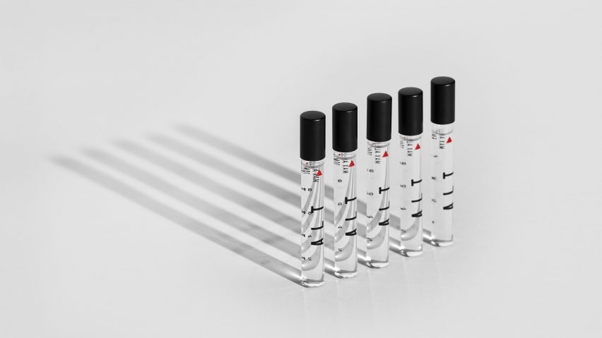
Science, aeronautics, and NASA inspired the Very Polite Agency's packaging design for ALT, a liquid cannabis product for people who want a mind-expanding rather than purely medicinal high.
The Canadian creative agency worked on every aspect of the brand identity with the ALT founders, including the name.
"ALT" is a play on the words "altitude" and "altered state" that eventually evolved into an acronym — Advanced Liquid Technologies.

The product has a couple of unique selling points: it is liquid in form, and it promises a controlled but deep high that, according to the brand, opens up neural pathways and gives users a chance to see things differently.
Very Polite saw a potential market among people interested in self-improvement based on scientific approaches, and they designed the packaging accordingly.

"ALT was rooted in scientific development, which we found interesting in a space where cannabis often has an 'organic' or 'granola' association, both in aesthetic and overall tone," Very Polite partner and head of creative Dylan Rekert told Dezeen.
"We wanted to pull from the science element without it feeling pharmaceutical. We had to find a way to make it work, and to us that came in the idea of performance."
Read More at source: Dezeen
Image Source: Dezeen
